How to Build an Affiliate Landing Page That Converts
A practical build order for affiliate landing pages: sharp offer, credible proof, clear CTA, reliable tracking and disclosure — plus a checklist and network shortlist.
Oct 1, 2026 · 8 min read
An affiliate landing page that converts is not a prettier blog post — it is a single-job page that states an offer, proves it, and sends the click through tracked links with a clear CTA. Design polish helps; unclear offers, buried proof and broken attribution kill earnings even when traffic is strong.
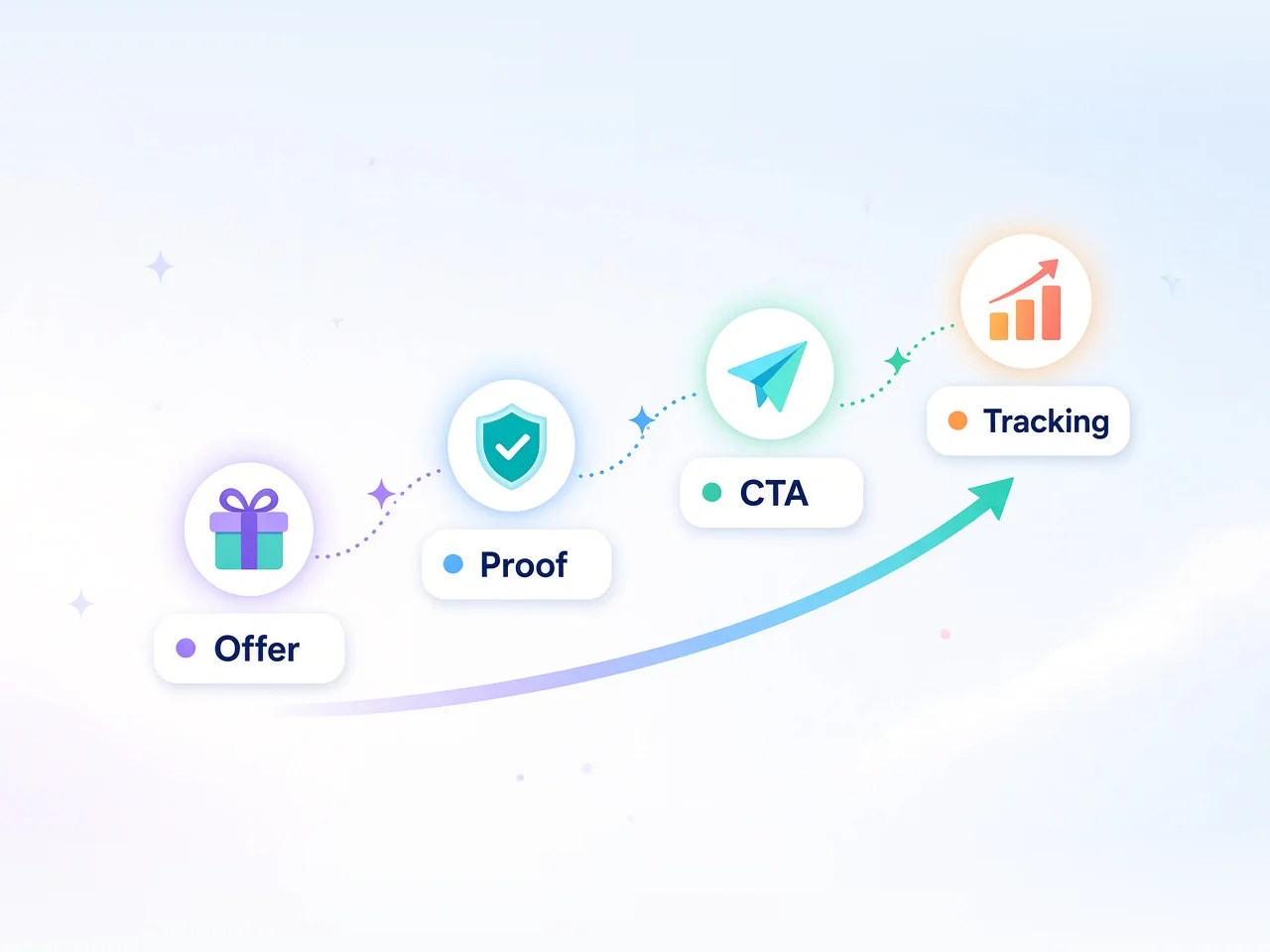
This tutorial is for publishers and performance marketers who promote network or merchant offers and need a practical build order: offer → proof → CTA → tracking → disclosure. It complements cookie and disclosure basics in and .
A converting affiliate LP does one commercial job for one audience segment. The visitor should answer three questions in seconds: what is this, why trust it, and what do I do next. Everything else is optional.
That differs from a review article (multiple options, long education) and from a homepage (many paths). Use a dedicated URL when you run ads, email blasts, or a pinned social CTA. Use a focused article section when SEO intent is comparative. Mixing both jobs on one URL usually dilutes the CTA.
Strong pages share four load-bearing parts: a sharp offer, credible proof, an obvious CTA, and reliable tracking — plus a visible disclosure so the recommendation stays compliant.
Specific result, demo clip, screenshots, third-party signal
Generic star ratings with no context
CTA
Direct the next click
One primary button verb repeated in-page
Five equal buttons to different merchants
Tracking
Attribute the conversion
Network deep link + subIDs + tested redirect
Bare homepage URL, no subID, parameter stripped
Disclosure
Stay compliant
Clear affiliate relationship near first CTA
Tiny footer-only note after the pitch
Offer copy should mirror the merchant’s allowed claims. Finance, health and income claims are especially constrained — if the program forbids earnings promises, your LP must too. Proof should be yours or clearly attributed: a blurred dashboard with no date teaches nothing; a dated screenshot of the workflow you describe builds trust.
CTA language beats decoration. “See current pricing” or “Start free trial” outperforms “Learn more” when the click goes to a trial or pricing deep link. Keep one primary CTA; secondary text links can support, but they should not compete visually.
Step-by-step: build the page
1. Pick one offer and one segment
Write the segment in a single line (“email creators choosing a first paid ESP”, “US readers comparing two travel cards”). If you cannot name the segment, you are not ready to build the page. Confirm the program allows your traffic type (content, paid, email, incentive) before you invest in creatives.
2. Draft the offer block above the fold
Above the fold needs: headline (outcome + audience), one-sentence subhead, primary CTA, and disclosure adjacent to the recommendation. Put the affiliate link on the CTA, not only on a logo. If you mention pricing, label it as approximate and date-sensitive — merchants change tiers often.
3. Add proof in the next screen
Choose two or three proof types max:
Process screenshots (onboarding, dashboard, key feature)
A short “who this is / isn’t for” box
A concrete result you can defend (time saved, workflow step removed) — never invent precision stats
Merchant or network trust marks only if accurately described
Avoid walls of testimonials you cannot source. One specific story beats five vague quotes.
4. Structure the middle for scanners
Use short H2/H3 sections: how it works, what’s included, comparison to the obvious alternative, FAQ teasers. A simple table for plan tiers or feature fit scans better than paragraphs. Keep every section pointed at the same CTA destination.
5. Place CTAs on a rhythm
Primary CTA above the fold, again after proof, and once near the end. Same URL parameters each time so reporting stays clean. Do not rotate five creative variants on day one — ship one clear path, then test.
6. Ship technical basics
Mobile layout, fast load, working deep links, HTTPS, and a thank-you or exit that does not hijack the merchant tab unexpectedly. If you embed videos, defer heavy scripts. A slow LP taxes paid traffic first.
A simple wireframe you can copy
You do not need a fancy builder to start. A single long page with this order is enough:
01Nav (minimal) — logo/home only; remove mega-menus that leak clicks
02Hero — headline, subhead, primary CTA, disclosure line
03Proof strip — 2–3 icons or mini-cards (speed, support, fit) without fake metrics
04How it works — three short steps aligned to the merchant’s real onboarding
08Short FAQ — three questions max on-page; deeper FAQs can live in post meta
Every H2 should earn a scroll toward the same CTA; cut sections that cannot.
Offer lines that stay honest
Weak: “The ultimate platform that guarantees results.” Stronger patterns:
“A [category] for [segment] who need [outcome] without [pain].”
“Compare [plan job] before you start a trial — then continue via our link.”
“Built for [segment]; not aimed at [excluded segment].”
Stay inside program creative guidelines; prefer approved headlines for paid traffic.
Tracking and disclosure
Tracking is part of conversion, not an afterthought. Use the network or program’s deep link to the most relevant page (trial, pricing, category), append subIDs for page, placement and campaign, and click-test in a private window before you spend. Understand whether the offer uses first-click or last-click logic and how long the cookie window lasts — a great LP still loses credit if the visitor converts outside the window on another device.
Disclosure belongs near the first persuasive recommendation and CTA, not only in a footer. State that you may earn a commission at no extra cost to the reader when that is true. For WordPress layouts and plugin patterns, follow a clear placement checklist rather than improvising.
When you outgrow a single merchant link, graduate to networks where deep linking, product feeds and reporting are built in. These four are verified directory listings many landing-page affiliates already use:
Impact.com and CJ Affiliate suit larger brand catalogs and serious content publishers; ShareASale and Awin cover broad merchant mid-tail with familiar reporting. Pick the network that already hosts your offer when you can — fighting a redirect chain across stacked platforms adds failure points. For a head-to-head on two of these stacks, see Impact vs CJ and ShareASale vs Awin.
Common mistakes
Design first, offer second — pretty hero, unclear promise
Multiple merchants, equal CTAs — decision paralysis on a “landing” URL
Homepage affiliate links — waste cookie time and muddy intent
No subIDs — you cannot tell which headline or channel paid
Claim creep — copy that outruns program terms or local advertising rules
Disclosure after the pitch — trust and compliance both take a hit
Ignoring mobile CTA thumb reach — desktop-only button placement
If click rate is fine but merchant bounce is high, fix the destination (deep link and message match) before rewriting the hero. If clicks are low, fix the offer line and above-fold clarity before touching colors. Report subIDs weekly so you retire weak placements instead of averaging them into one optimistic number.
Stabilize one page’s economics before you widen via the Affground directory.
Launch checklist
01Segment and offer written in one sentence each
02Above-fold headline, subhead, CTA, disclosure
03Proof block with dated, specific evidence
04One primary destination URL with deep link + subIDs
05CTA repeated 2–3 times with identical tracking
06Click-test on mobile and desktop; confirm cookie/parameters
07Page speed acceptable on a mid-tier phone network
08Claims checked against program terms
09Analytics event on CTA click (even a basic one)
10Calendar reminder to re-verify links after merchant or network changes
Optional after traffic exists: test headline clarity and CTA verb before you test button colors. Clarity moves conversion more than gradient tweaks. When volume is real, ask for better terms with landing-page EPC and conversion notes attached.
Affground's verdict
Conversion is a clarity stack: offer, proof, CTA, tracking — in that order. Ship a single-job page with deep links and an honest disclosure before you obsess over visual polish. Use network tooling when you need reliable attribution at scale, measure which CTA placements earn, and only then iterate design.
Frequently asked questions
What makes an affiliate landing page convert?
A single clear offer for one audience segment, credible proof, one primary CTA, working tracked deep links, and an honest disclosure near the recommendation. Visual polish helps only after those pieces are solid.
Should I use a landing page or a full review article?
Use a dedicated landing page for paid, email or social traffic with one job. Use a review or comparison article when search intent is educational or multi-option. Mixing both jobs on one URL usually weakens the CTA.
Where should the affiliate disclosure go?
Near the first persuasive recommendation and primary CTA — not only in a footer. Readers should understand the commercial relationship before or as they are asked to click.
What tracking setup do I need?
Use the network or program deep link to the most relevant destination, append subIDs for page and placement, and click-test redirects before spending. Know the cookie window and attribution model so delayed conversions are expected, not surprising.
Which affiliate networks help with landing-page promotions?
Impact.com, CJ Affiliate, ShareASale and Awin are common choices with deep linking and reporting. Prefer the network that already hosts your merchant when possible to avoid stacked redirects.
How many CTAs should an affiliate landing page have?
One primary CTA destination, repeated two or three times (hero, after proof, end). Multiple equal buttons to different merchants usually create hesitation on a page meant to convert.
Can I guarantee earnings or results on the page?
Only if the program and applicable advertising rules allow specific claims — many do not. Prefer outcome language you can defend, clear fit/exclusion lines, and dated screenshots over invented statistics.
What should I test first after launch?
Headline clarity and CTA verb, then deep-link destination match. Button color tests rarely outperform fixing a vague offer or a mismatched merchant URL.